
Add the legend title of each line at the right of the last observation on a timeseries. Use clip = false vs. right = of <node> vs. right of = <node.
Preparing high quality, publication-ready, figures raises several questions. These questios usually have to do with the readibility and presentation of a graph. Exporting data from .csv and plotting them directly using the PGFPlots package of \LaTeX is a beautiful and publication-robust way to proceed. This post will solve an issue with lineplots when you wish to avoid using the traditional legend outside the graph region. The alternative suggestion is to add the legend entry of each line at the end, on the right of the latest entry of the series.
There are at least three options you could use: (a) right of = <node>; (b) right = of <node> and (c) clip = false. Personal preference is (c). The result may look similar - especially for choices (b) and (c). However, their difference relates to the distance between the end of the line and the first letter of the text.
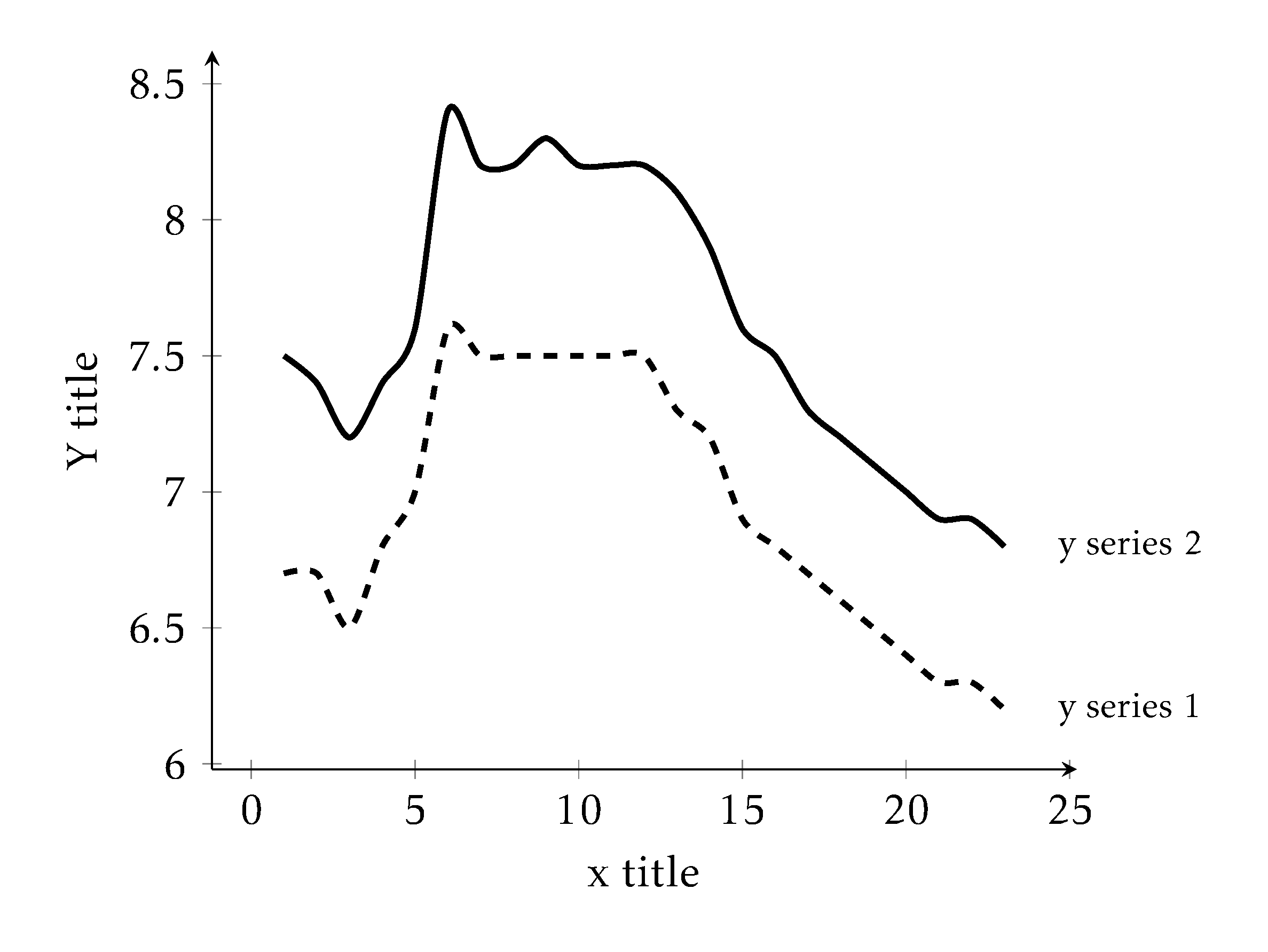
right of = <node>
This option has the biggest gap between the end of the line and the first letter of the text.
Steps for this method
Define coordinates: In the axis environment, you need to define the coordinates next to which you need the text. To do so, at the end of each
\addplotwe add thenodeand in parenthesis we define the coordinates of the timeseries.Text: To add the the text, outside of the axis enviroment, call
\nodeand in square brackets add the option you wish. In this case[right of = <node>]. In curly brackets you add the text you wish.
Note that this method may be depreciated in newer versions of the pgfplots.
\begin{tikzpicture}
        \begin{axis}[
            % only yaxis on the left and xaxis on the bottom - use if positive values only
            axis lines = left,
            grid = none,
            % axis grammar
            % enlarge limits on both axis for readibility
            enlarge x limits,
            enlarge y limits,
            % axis titling
            ylabel={Y title},
            xlabel={x title},
            % plot title
            title={`right of = <node>'},
            % keep baground empty in case you need to use any shading for areas
            axis background/.style={fill=none},
            % method csv table is formed
            table/col sep = comma
            ]
            \addplot[very thick, dashed, smooth] table[x=x, y=y1]{data/unemplEU.csv} node(y1){};
            \addplot[very thick, smooth] table[x=x, y=y2]{data/unemplEU.csv} node(y2){};
        \end{axis}
    \node[right of= y1] {\footnotesize y series 1};
    \node[right of= y2] {\footnotesize y series 2};
\end{tikzpicture}
Output
right of = <node>right = of <node>
Steps for this method
Define coordinates: In the axis environment, you need to define the coordinates next to which you need the text. To do so, at the end of each
\addplotwe add thenodeand in parenthesis we define the coordinates of the timeseries.Text: To add the the text, outside of the axis enviroment, call
\nodeand in square brackets add the option you wish. In this case[right = of <node>]. In curly brackets you add the text you wish.
\begin{tikzpicture}
        \begin{axis}[
            % only yaxis on the left and xaxis on the bottom - use if positive values only
            axis lines = left,
            grid = none,
            % axis grammar
            % enlarge limits on both axis for readibility
            enlarge x limits,
            enlarge y limits,
            % axis titling
            ylabel={Y title},
            xlabel={x title},
            title={`right= of <node>'},
            % keep baground empty in case you need to use any shading for areas
            axis background/.style={fill=none},
            % method csv table is formed
            table/col sep = comma
            ]
            \addplot[very thick, dashed, smooth] table[x=x, y=y1]{data/unemplEU.csv} node(y1){};
            \addplot[very thick, smooth] table[x=x, y=y2]{data/unemplEU.csv} node(y2){};
        \end{axis}
        \node[right=of y1] {\footnotesize y series 1};
        \node[right=of y2] {\footnotesize y series 2};
\end{tikzpicture}
Output
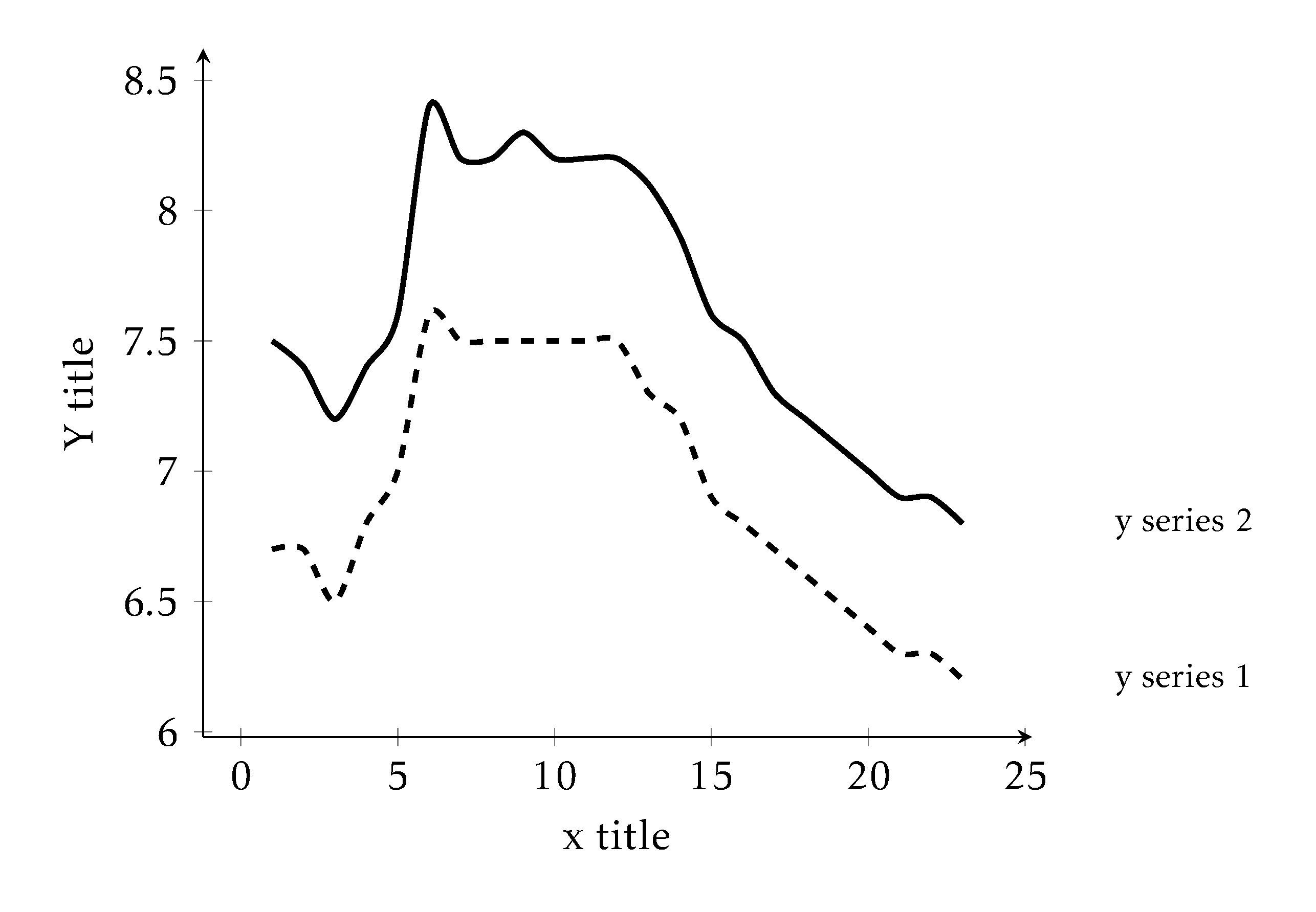
right = of <node>clip = false
Steps for this method
De-activate clip In the axis environment, add at its options that
clip = falseText: In the same environment, at the end of the
\addplotthere is no need to define the coordinates. Directly, thenodefunction and add square brackets[right]. In curly brackets you may add the text.
There is nothing to be added outside of the axis environment here.
\begin{tikzpicture}
            \begin{axis}[
                % only yaxis on the left and xaxis on the bottom - use if positive values only
                axis lines = left,
                grid = none,
                % axis grammar
                % enlarge limits on both axis for readibility
                enlarge x limits,
                enlarge y limits,
                % axis titling
                ylabel={Y title},
                xlabel={x title},
                title={`clip = false'},
                % keep baground empty in case you need to use any shading for areas
                axis background/.style={fill=none},
                % method csv table is formed
                table/col sep = comma,
                % to add text right of the end of the series
                clip=false
                ]
                \addplot[very thick, dashed, smooth] table[x=x, y=y1]{data/unemplEU.csv} node[right]{\footnotesize y series 1};
                \addplot[very thick, smooth] table[x=x, y=y2]{data/unemplEU.csv} node[right]{\footnotesize y series 2};
            \end{axis}
\end{tikzpicture}
Output

clip = falseOverall document
The following code reproduces a .pdf file with all the above figures.
\documentclass[12pt,a4paper]{article}
\usepackage{pgfplots,amsmath}
\usetikzlibrary{positioning}            % needed for right of
\pgfplotsset{compat=newest}             % compatibility option for the entire document
\usepackage{kpfonts}            % nice fonts

\begin{document}

\begin{figure}
    \centering
    \begin{tikzpicture}
            \begin{axis}[
                % only yaxis on the left and xaxis on the bottom - use if positive values only
                axis lines = left,
                grid = none,
                % axis grammar
                % enlarge limits on both axis for readibility
                enlarge x limits,
                enlarge y limits,
                % axis titling
                ylabel={Y title},
                xlabel={x title},
                title={`clip = false'},
                % keep baground empty in case you need to use any shading for areas
                axis background/.style={fill=none},
                % method csv table is formed
                table/col sep = comma,
                % to add text right of the end of the series
                clip=false
                ]
                \addplot[very thick, dashed, smooth] table[x=x, y=y1]{data/unemplEU.csv} node[right]{\footnotesize y series 1};
                \addplot[very thick, smooth] table[x=x, y=y2]{data/unemplEU.csv} node[right]{\footnotesize y series 2};
            \end{axis}
        \end{tikzpicture}
    \caption{}
\end{figure}

\begin{figure}
    \centering
    \begin{tikzpicture}
        \begin{axis}[
            % only yaxis on the left and xaxis on the bottom - use if positive values only
            axis lines = left,
            grid = none,
            % axis grammar
            % enlarge limits on both axis for readibility
            enlarge x limits,
            enlarge y limits,
            % axis titling
            ylabel={Y title},
            xlabel={x title},
            title={`right of = <node>'},
            % keep baground empty in case you need to use any shading for areas
            axis background/.style={fill=none},
            % method csv table is formed
            table/col sep = comma,
            % to add text right of the end of the series
            clip=false
            ]
            \addplot[very thick, dashed, smooth] table[x=x, y=y1]{data/unemplEU.csv} node(y1){};
            \addplot[very thick, smooth] table[x=x, y=y2]{data/unemplEU.csv} node(y2){};
        \end{axis}
    \node[right of= y1] {\footnotesize y series 1};
    \node[right of= y2] {\footnotesize y series 2};
    \end{tikzpicture}
\end{figure}

\begin{figure}
    \centering
    \begin{tikzpicture}
        \begin{axis}[
            % only yaxis on the left and xaxis on the bottom - use if positive values only
            axis lines = left,
            grid = none,
            % axis grammar
            % enlarge limits on both axis for readibility
            enlarge x limits,
            enlarge y limits,
            % axis titling
            ylabel={Y title},
            xlabel={x title},
            title={`right= of <node>'},
            % keep baground empty in case you need to use any shading for areas
            axis background/.style={fill=none},
            % method csv table is formed
            table/col sep = comma,
            % to add text right of the end of the series
            clip=false
            ]
            \addplot[very thick, dashed, smooth] table[x=x, y=y1]{data/unemplEU.csv} node(y1){};
            \addplot[very thick, smooth] table[x=x, y=y2]{data/unemplEU.csv} node(y2){};
        \end{axis}
        \node[right=of y1] {\footnotesize y series 1};
        \node[right=of y2] {\footnotesize y series 2};
    \end{tikzpicture}
\end{figure}

\end{document}Citation
@online{galanakis2022,
  author = {Galanakis, Yannis},
  title = {PGFPlots Lineplot Naming Options},
  date = {2022-05-30},
  url = {https://www.yannisgalanakis.com/blog/2022/pgfplot_clipfalse},
  langid = {en}
}